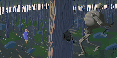
In retrospect pretty much everything about this thing is awful. The colors especially in the shadows are too muted. The poses do not connect. There is a boring attempt at realism. The background color adds nothing to the piece.
Lately i've been discovering the virtues of a more cartoony style. Style brings with it personality and feeling. Something absent in this painting.
I'll post bg's and animation of my thesis-project when they are ready. I'm up against a killer-deadline on it.


